Top Ten Tuesday is a weekly meme hosted by the lovely folks over at The Broke And The Bookish. Every week, bloggers from all over are invited to share their own Top Ten List based on the topic of the week. You can find all Top Ten Tuesdays here.

Top Ten Covers I Wish I Could Redesign
Since I’m a mostly e-book/audiobook person, I don’t pay attention to covers most of the time. When I add them to my reviews? That’s probably the only time I look at the cover, but I always manage to find a few that I wish were really different. Here are my picks for covers that need to be redesigned.
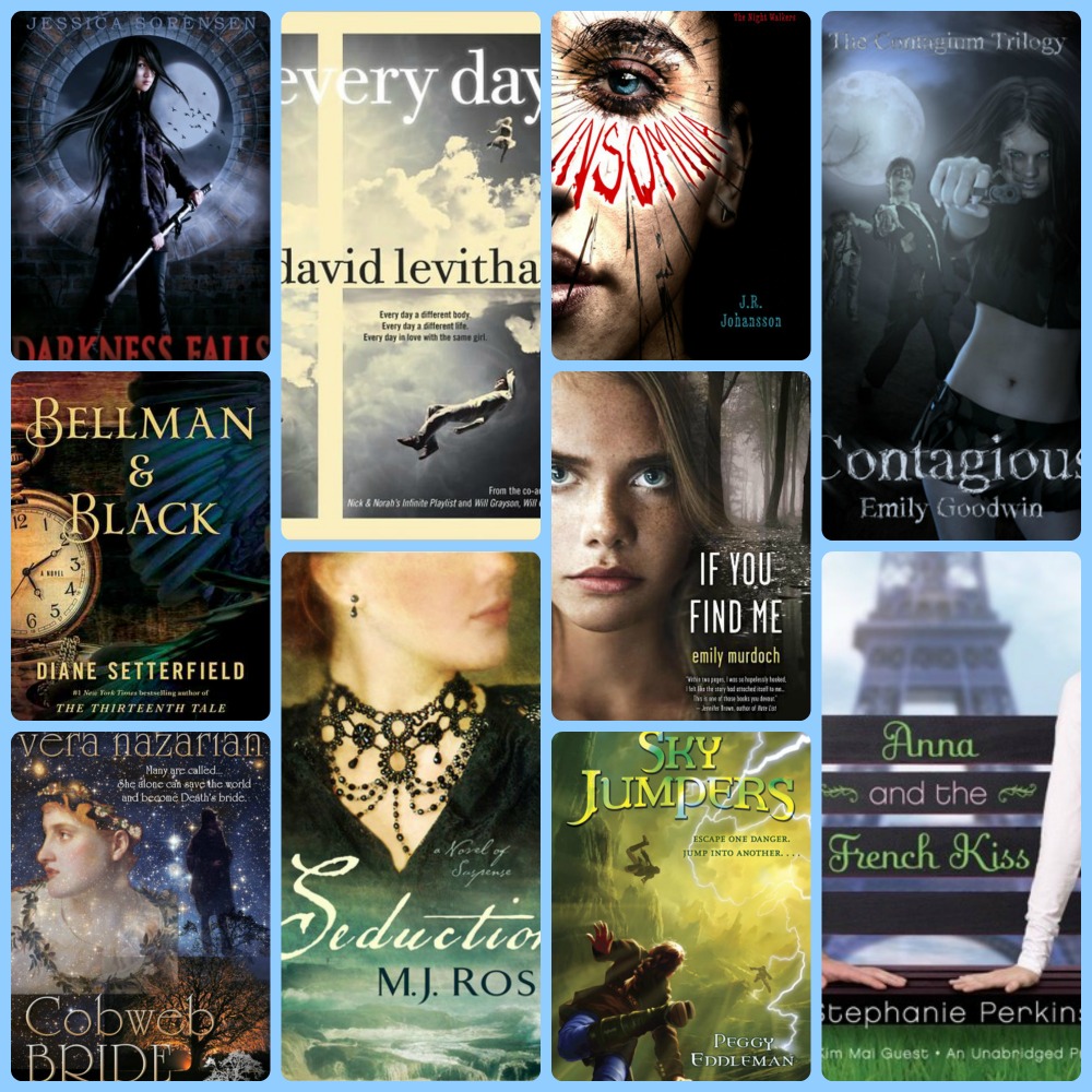
- Darkness Falls by Jessica Sorensen. Overall, it’s just a bit too dark, and it needs a little bit of contrast in terms of colors.
- Bellman & Black by Diane Setterfield. Because I’m not quite sure what’s going on in the cover. It feels a little too cluttered to me.
- Cobweb Bride by Vera Nazarian. I like the book but the statue looking female needs to go. Seriously. That’s the only thing wrong with the cover.
- Every Day by David Levithan. That random white strip towards the left needs to go away. It makes me feel like something when wrong when the cover was being worked and they forgot to fix it.
- Seduction by M.J. Rose. I don’t like the colors. Also, I don’t like that you don’t see her eyes. Half-faces are kind of annoying.
- Insomnia by J.R. Johansson. The stuff on the guys face? Kind of random. Seriously, what is that?
- If You Find Me by Emily Murdoch. Um, the girl is really creepy, especially the way she’s staring right at you with big eyes. This is one case where I’m glad I don’t have to look at that cover.
- Sky Jumpers by Peggy Eddleman. One, the colors NEED to be different. And: I know what this scene is supposed to be, but it needs to be different. It’s just not how I pictured it to look.
- Contagious by Emily Goodwin. I don’t particularly like her pose. And more importantly, I would change her outfit…mostly because that seems like a really bad outfit to wear during the Zombie Apocalypse.
- Anna And The French Kiss by Stephanie Perkins. I LOVE Anna And The French Kiss. But why is Etienne not on the cover? Because I would totally put him on the cover. I don’t get why we only see his arm.

Covers say a lot about a book. Nice list this week. kelley—the road goes ever ever on
They really do! Thanks for stopping by!
Great picks, some really awful covers! I really do like my books to have nice covers. My TTT.
It’s nice when covers are nice. Because if something is going to be on my physical bookshelf, it better not be horrendous-looking.
If you’re unhappy with the lack of Etienne on the cover of Anna and the French Kiss, then I guess you don’t like the redesign, huh? I wasn’t a fan of this cover because it kind of turned me off from the book (although I did end up enjoying it for the most part), but I think I like the new redesigns – they’ve grown on me.
I didn’t know they redesigned the cover for Anna, but I’ll have to take a look at it and see if I like better than the original.
Micro-mini skirts are TOTALLY the best thing to wear during a dangerous adventure! Except for the fact that they totally are not…
I know, right?! 🙂